Monday 11 May 2015

Animation Reflection

Harlan Brownrigg-Ross
Ball Bounce
Flash and Photoshop
For this assignment, I used Flash instead of Photoshop as I found it much easier to use. I drew all of my animation frame by frame, other than the background that I used Photoshop for. Other than that nothing else was really used.
My idea for this was to make a ball bounce then it changed to a ball of water turning into a tree.  As I worked on it my tree changed a few times before I liked the final version. Other than that, nothing else changed.
No particular artist influenced me for this project.
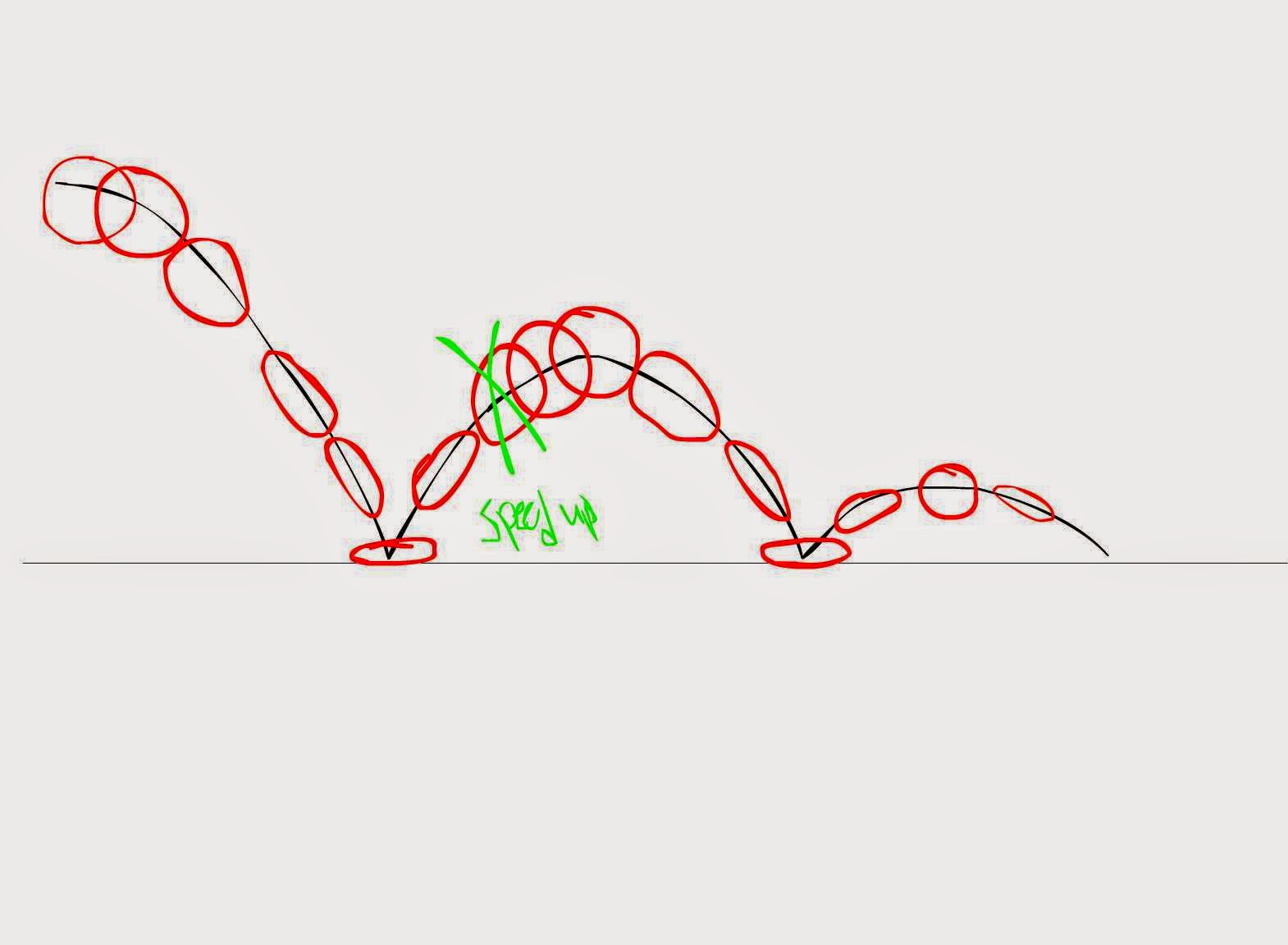
I used asymmetry in my animation so it would look more natural. I had the background blurry so that it would give depth to the animation showing the foreground much more in focus. I used things like squash and stretch to make the motion of the ball look more lifelike. When you look at it, your eyes keep focus on the ball which move them, around the screen to the tree.  
My personal motivation for this was that I really liked doing this, I found it different from our normal work. I guess just wanted to try animation, no real visual style or anything but just an attempt at animation.

I feel that my background and timing were very successful and interesting. Nothing really surprised me too much. With additional time I probably would have made the ball look better and set up a much better background. Maybe I would have added reflections of the background in the water ball. 

Animation Plan

Ball of water bounces twice then soaks into ground and a tree grows.

Animator - William Hanna

William Hanna was a famous animator and person in general. Hanna was born in New Mexico in 1910. He had a rather ordinary childhood. 20 years later in 1930, he started working at Harman-Ising Studios, the studio that is responsible for shows such as Marie Melodies and Loony Tunes. Several years later he started work at MGM Studios. It was there that he met and started to work with Joseph Barbera. It was then that they created one of their most famous cartoons, Tom and Jerry.  In 1957 Hanna and Barbera set out on their own and created Hanna-Barbera Studios. From there they stared making shows such as Yogi Bear and The Huckleberry Hound Show. By 1960 their studio had created The Flinstones. Not too long after that The Jetsons was made. By the late 60’s they stared on another very famous show, Scooby-Doo Where Are You?. Together, both Hanna and Barbera produced the shows. Hanna took on more of a directing job as things got busier. In the end their studio had put our nearly 150 different animated TV shows and thousands of episodes. Many people all around the world grew up watching shows he created. William Hanna passed away on the 22nd of March, 2001 at the age of 90. His life’s work will be remembered for years to come. 

Ball Animation


Monday 4 May 2015

Spirited Away Critique

1.       I think that the use of more familiar folklore make the story much easier to understand, although they aren't as obvious unless you are looking for them. I think they added to the story making some things easier to understand for the viewer by showing things they may already know about.

2.       I think that for some people who believe in things like that, it is helpful to think that spirits are needed to help get through everyday life. Personally, I don’t really believe in things like that. I don’t really think it’s the solution but I don’t think that it’s a bad thing. I don’t really know what the solution to the environmental problems are but I think just acting more “green” and not polluting as much would help. 

Friday 1 May 2015

Tuesday 28 April 2015

Culture Jam Reflection

  1. What aspect of your culture jam do you find most successful and why?
I think that the barrel of oil I made is really successful alongside the slogan of the company.  I think they go well because the ad is taking the slogan more literally by actually spilling the oil.  
  2. What aspect of your culture jam do you find least successful and why?
Least successful of the culture jam would be that there isn’t a whole lot to it.  It also looks a little fake because of the barrel I made, it could have been better with more time. I doesn’t look too professional.
   3. If you could do this project again, what changes would you make to improve it?
      If I could do this project again, I would probably work harder on the image I made of the barrel, getting it to look much more real and better quality, so that the ad looks more professional. 

Tuesday 14 April 2015

Culture Jammer


What Company does the advertisement represent/subvert?
Image 1: Many, Facebook, McDonalds, Volkswagen, Nike, Apple, Lacoste.                           
Image 2: No company in particular is being advertised.
What kind of product(s) is being advertised?
Image 1: No product is being advertised. But it’s showing many major brand logos.
Image 2: No product is being advertised.
What imagery is used in the advertisement to subvert?
Image 1: Images of major company logos next to tree leafs. Saying that brands are more recognizable than plants.                                                                                                                                     Image 2: A bar code that mixes in with what seems to be cell bars. Saying that we’re trapped buying things.
What message (text, copy) is used in the advertisement?
Image 1: It’s asking the viewer to name the brands and name the trees the leaves are from.
Image 2: There is no text but there is the numbers of the bar code.
How are the elements and principals of design used to convey a message?                                              Image 1: I guess variety and unity are used most in this one. There is a variety of shapes and all the parts work together.  
Image 2: Emphasis is used in this one because the hands really stand out next to the lines of the bar code.
Who is the target audience of the advertisement?
Image 1: Anyone that would know the brands, so children to seniors.
Image 2: Anyone from their early teens onwards.
Does the ad jam convey a clear and successful message?
Image 1: I think it conveys a very clear message that most people can name the brands then they can the leaves.
Image 2: Yes this one does as well. It’s saying that we can’t get out of our habit of spending. We’re like a prisoner.
How could the ad jam be improved?
Image 1: Maybe adding a little more to it, like a different font, maybe a border, so it look a little more appealing.

Image 2: Maybe if the editing of the images was a little better. Also if it has text giving more information to the viewer. 
                                             Image 1                                                                        Image 2
 

Thursday 9 April 2015

Reflection

3D Post-Apocalyptic World Reflection

Harlan Brownrigg-Ross
Apocalyptic World: 3D
Photoshop CC 2014

In this piece of work, I made and used a variety of brushes, not only ones that I downloaded, but ones I made as well. Making brushes was quite simple and over all I made about 20 of them. With some of the brushes I had to play around with perspective to get them looking the way I wanted and so they wouldn’t look out of place. I used gradient tools for gradual color changes in different areas of the piece. I also used multiple layers so that I could change every small thing I added.

I used my own outline to help me think of ideas to put in the piece. Throughout the building process I did change some things around just because I couldn’t get brushes to look right. I had some trouble finding images that were taken in the right perspective too. I couldn’t fix the perspective on every image I found. I had to change that way I wanted to show the underground area, because with the 3D some of my ideas didn’t look right to me. But other than stuff like that it went smoothly.

I guess my influence for some of the piece was some of the T&T art work we were shown in class. But other than that I used my head.
For composition, I didn’t want too much symmetry, so I went for a more asymmetrical look. When I look at the piece, my eyes go to the bottom left then up then across to the bottom right corner then up. You can see the things going on in the bunker, and looking into the background, you can see mountains, buildings, a crater, old cars, lots of small details.

I enjoyed making this piece of art. I found it quite interesting to do. I thought it was an interesting assignment. I guess a visual idea I had was to make it look like life was going on underground. I was hoping that the underground area would look better.


I think the bunker underground looks the best next to the mountains and clouds in the distance. Nothing much surprised me in the piece, other than the table with how it came out and went back looking like it was quite 3D. I guess if I had more time, I would try and add more detail in the world. I’d probably make the underground look better maybe adding more people like a small community. 

3D Post-Apocalyptic World


Wednesday 25 March 2015

How is Hero an Art Movie?

1. By looking at the explanation of an art movie above, please describe at least three ways (three sentences) that you think Hero could be considered, at least in part, an art movie.
I think Hero can be considered an art movie because the film was very serious. The story wasn't trying to be a comedy or an over the top action movie. The movie was quite simple, nothing overly complicated, nothing expensive, it would have had a budget but no where close to non art movies. Most of the movie takes place in the King's palace, but everything you see was what they said or what they though happened. The story changes a few times based on what Nameless and the King. The film was confusing at times but it made sense as things went on.
2. How does the director also make this movie for everybody, so that it's not too artistic or alienating for the average viewer? Please explain in at least four sentences.

The director made this movie for everyone by adding a story line that could be easily followed by anyone watching. He may have also kept things calm and made sure that the story wasn't all over the place. The film was still very artistic and not too alienating, I'm sure many people would see it as a regular movie rather then an art film.  
3. Did you like this movie? Why or why not? Please explain in at least four sentences.
I did like this movie. The film had a nice story. It looked nice, it had good filming and sound and everything felt like it belonged. I didn't have any problems understanding the story. I'm sure I still would have enjoyed the movie without the subtitles, I still would have understood somewhat what happened.
4. Sequences in the film are 'colour coded', enabling Zhang Yimou to offer his audience ravishing and memorable images which enhance his action sequences. Write three sentences about how Zhang Yimou has used colour to emphasize or enhance aspects of the narrative.
Select one of the sequences:
  • the fight in the rain
  • the Golden Forest
  • the attack on the calligraphy at Zaho
  • the Library
  • the combat at the lake
  • Broken Sword ans Flying Snow's attack on the King 
The Golden Forest fight's colours used in the scene was very nice. The colour of the yellow leaves really brought out the red and pink that Flying Snow and Moon are wearing. Then when Moon died, and the drop of her blood fell, all the leaves changed to a redish purple. The yellow could have represented Flying Snow's anger towards Moon and Broken Sword. Then when everything turned red, Snow's mood changed and she killed Moon and that the gold is now like blood.  


Friday 20 February 2015

I Want To Believe


Montage Reflection

Harlan B. 
I Want To Believe: Montage
Photoshop CC 2014
February 20th, 2015

In my art piece, I used tools such as the Marquee Tool, Quick Selection Tool, Magic Wand Tool, Erasers, Brushes and the Dodge and Burn tools. Also things like Layer Blends.  The idea I used in this piece was that there is life out there, that we humans aren't the only forms of life in the universe. As I worked on my piece, to me seemed to have more of a discovery feel to it, like that there's more to discover. Although discovery does have some coloration to there being other life out there, it just wasn't my main idea in the beginning I do think it worked out alright in the end.
 I didn't really have any influences from any artists in my work. For this piece I wanted to stay away symmetry because I wanted it too be unique, not that symmetry isn't, but that i want it to be different all around the image rather than just have it be repeated. I feel having the image be asymmetrical was a good choice because when you look all around the image, it's different all over.
When I look at the image, my eye starts at the bottom with the astronaut, then upwards to the spaceship, then to the satellite. From there my eyes go towards the large earth then down to the Wow! signal, and back to the astronaut. I guess my motivation for this piece other than to complete the assignment was my interest in the subject of space and life beyond earth.
Elements I found interesting were the was all the colours blended together nicely. Something else I think works good is the little hints I put in. For example the Wow! and the numbers isn't a random image I added, it's a signal that was received back in 1977, that came from somewhere in deep space, nothing like it has ever been received again. Nothing about the process really surprised me. I think with additional time, I would have added more images and more little hints to things about my subject.  

Wednesday 11 February 2015

I Want To Believe

10 Ideas for this piece of art:
  1. That there is life some place other than earth.
  2. That one day people will one day live somewhere other than Earth.
  3. That maybe there is a God.
  4. That everything doesn't end after we die.
  5. That the Earth will one day become a peaceful place live. 
  6. That one day i will accomplish my goals. 
  7. There is a reason for everything that happens. 
  8.  That there won’t be another world war.
  9. That one day we can travel forward in time.
  10. That everyone is here for a reason.

 I like the idea of number one because space and things like this. I like to think that there is life elsewhere in our universe than just here on earth. It appeals to me because I have always been interested in anything space related, and it has always been something that I feel that could be real. There's just so much possibility of what could be out there.                                                                                                                                                                   In a piece of art I would like to say that it's possible that life is elsewhere. I want to say to people to keep their mind open about things like that, that there can be life on another planet, because it would be silly to think that earth is the only planet to have life. I would like to show variety and curiosity about whats out there. And to show vastness about how open and far away things are but also how close we are to discovering other life. 

When someone looks at my art, I would like them too feel curious and I would also like them to wonder about the possibilities. I want people to think more about what is out there. And that they might still be around if (or when) we do discover life somewhere. I want them to feel that it is very possible that we are not on the only planet that supports life.